Mobile technology has over the recent years shown remarkable growth and has evolved to become a multifunctional device that not only communicates, but helps us learn, earn, and have fun. Technology is advancing rapidly and people are now inclined toward high-end smartphones, tablets, and other mobile devices. Though Android and iPhone are the most preferred platforms for application builders, the Mobile Web platform is gaining momentum. We see some of the leading organizations are increasingly using the mobile web as a platform to reach their consumers.
A typical conversation heard in a mobile app development center:
Manager: Could you please assess the quality of our mobile web application in the brand-new iPhone series? The customer has reported a few vulnerabilities in the performance aspects.
Tester: Oops!!, we haven’t procured those device series so far and have not yet identified the right tool to cross-check the same.
The above concerns raised from both sides happen in a large number of mobile web application development centers. Device fragmentation, screen resolution, processing power, etc makes mobile testing very challenging. Having all devices handy is not a practical solution due to the cost; also upgrades and new devices get released frequently.
In this article, I would like to touch upon a few mobile web testing tools for testing your site on mobile devices. These are basic web-based emulators, which allow you to check your site on an emulator’s mobile screen.
Mobile Web Testing Tools
Dynatrace
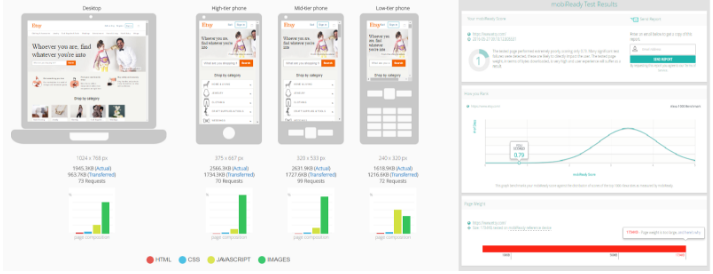
The Dynatrace mobile readiness test evaluates how well your website will perform on a mobile phone. The tool provides detailed reports on Response-Time, Content analysis, Industry comparison reports, etc. Each report provides a score based on an in-depth analysis including suggestions for fixing the issues identified.
Price: Free
Link: Dynatrace
MobiReady
The mobiReady score represents how well a particular web page will do across the spectrum of mobile internet devices. MobiReady provides a score between 0 and 5 scores, with 5 being the top and 0 being the least. If a web page scores high on mobiReady the application will be capable of providing a greater extent of user experience on diverse mobile device types. Low-scoring webpages indicate that they might be slow to load, of poor application design, or incorporate components that will crack the user experience on mobile devices.
Price: Free.
Link: MobiReady
W3C mobileOK Checker
The W3C validators are hosted on server technology donated and Hewlett-Packard and supported by many more community donations across the globe. This checker performs various tests on a web page to determine its ease and level of mobile-friendliness and usability factors. A web page is certified to be mobile-friendly when it passes all the tests.W3C primarily assesses basic interoperability, usability, and efficiency, and is based on the WS3 Mobile Web Best Practices. It supports various validations such as Validation by URL, File Upload, and Direct Input.
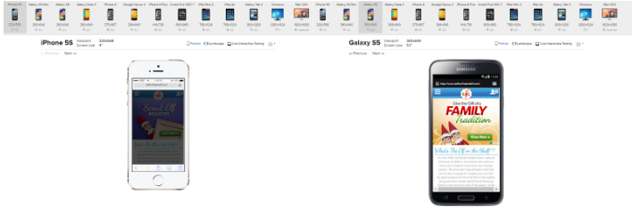
BrowserStack
BrowserStack provides web-based browser testing with live interactions and a screenshot check facility. It helps to fast access remote browsers, developer tools, and live testing. BrowserStack has a wide collection and access to official mobile emulators distributed across different platforms such as Apple iOS, Android, and Opera Mobile. You can test and analyze your site over a large extent of devices. Since the application is paid, we can perform a responsive test on various devices free of cost. BrowserStack provides a free trial option for 30 minutes of live testing.
Price: Plans start at $19/month
Link: BrowserStack
Perfecto Mobile
Perfecto Mobile is one of the leading mobile cloud platform services which provides competence for Mobile Monitoring, Performance Testing, and Test Automation. Perfecto Mobile’s MobileCloud platform facilitates you to associate with real mobile handsets and tablets which are connected to live mobile networks distributed in different geo-locations. It grants you to analyze your test and monitor the processes on each handset and establish the ideal compatibility of your site, application, or service.
Screenfly
Screenfly allows you to view your website on a collection of device screens and resolutions. It contains various platforms simulators such as Desktop, Tablet, Mobile, and Television as well. All you need to do is to enter the URL and click on GO to get started.
Price: Free
Link: Screenfly
Mobile Phone Emulator
This emulator permits you to see your site on a mixture of mobile phones, including Apple iPhone, BlackBerry, HTC, LG, and Samsung.
The Responsinator
The Responsinator assists you rapidly in getting an indication of how your responsive site will be viewed on the most popular devices, such as Android, iPhone, and iPad.
Price: Free
Link: The Responsinator
Matt Kersley’s Responsive Design Testing
This is an addition to the responsive web design testing toolset… Test your site in several widths at the same time. All you need to execute is that, enter the URL into the address bar to test a unique page.
Price: Free.
Link: Matt Kersley’s Responsive Design Testing
Conclusion
This article is about the usage and peculiar features of a few handy tools which help mobile web development centers, resolve some of the technical and design hurdles. As you optimize your code for specific devices, it changes the functionality of others. All of these different renderings and interpretations are not to be considered bugs (well some are) but instead features of the device. This might seem like a major issue to developers and designers stuck in a pixel-perfect world, but in real-world scenarios, these contrasts are acceptable, even expected. Not all phones are created equal, it varies in screen size and resolution, installed fonts, colors, HTML and Javascript support, etc. So the best you can do is present the best, most extensible, equivalent design you can which does not mean identical. This is where testing is key! The sooner you accept the above-mentioned tools, the best quality can be ensured while releasing a mobile-friendly web app. Testing is a critical part of any web development process, but especially so for mobile devices due to the various scope of devices and capabilities.
Need help? Contact us now!